Information is Ugly
2022
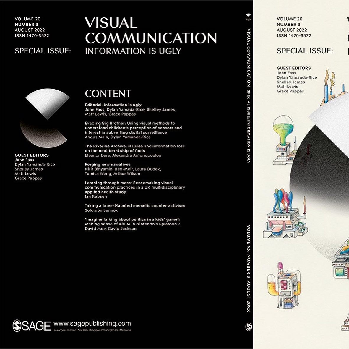
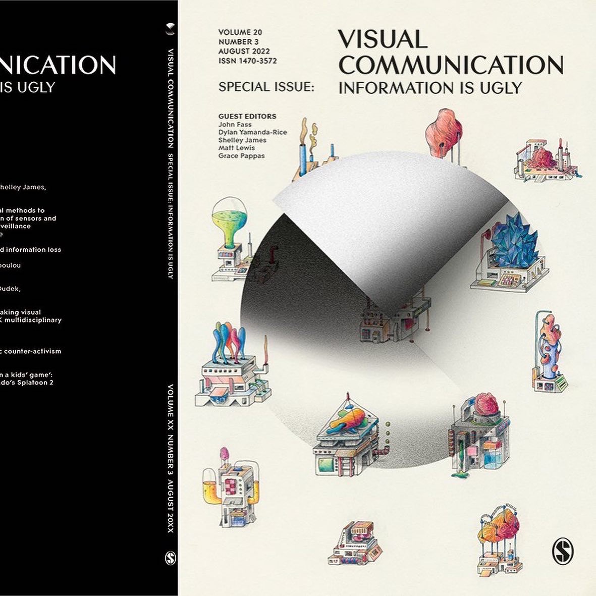
Special Issue for Visual Communication Journal Vol.20 (3) August 2022, ISSN 1470-3572.
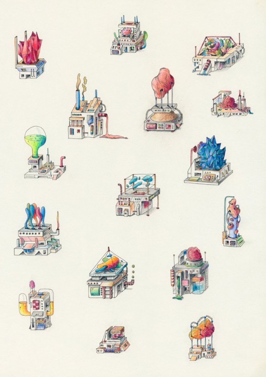
When I was on the brink of leaving the RCA, the course was taking a new direction. The RCA was moving all two-year MAs to be one-year. The dissertation was being removed as one significant chunk, and conversations were afoot for a new name and new “graduate destinations”. I was part of a heated discussion on how I believed the course was not about data visualisation and making ALL information beautiful. As my “swan song” I put together a special issue with some great IED colleagues and students called Information is Ugly for the journal of Visual Communication. The editorial was described by the peer reviewers as surprisingly ideological. I am glad that it was perceived this way. The issue is open access for all to read.
Editorial: Information is Ugly
John Fass, Dylan Yamada-Rice, Shelley James, Matt Lewis and Grace Pappas
Design frameworks that outline the benefits of thinking in terms of binaries suggest that, as designers, we can situate ourselves and our work in relation to opposite extremes. Doing so is more likely to bring about innovation and imagine ideological possibilities. This Special Issue creates a binary between ugly and beautiful with a specific focus on the former. The standard dictionary definitions of ugly are in relation to an unpleasant or repulsive appearance or a topic that is likely to involve violence or other unpleasantries. We draw both definitions into our discussion.
Evading Big Brother: Using visual methods to understand children’s perception of sensors and interest in subverting digital surveillance
Angus Main and Dylan Yamada-Rice
In relation to this Special Issue’s focus on ugly information, this article examines children’s perception of the often invisible interactions they have with sensor-enabled digital devices and, when prompted, their interest in subverting or blocking these sensors to evade surveillance. The authors report on a study of 12 children, aged 8–12 years, that investigated their knowledge of the sensing abilities of commonly used digital devices (smart phones, smart watches, smart speakers and games consoles), and their attitudes towards having active agency over sensors. In line with this journal’s readership, visual methods used for data collection and analysis are described. Specifically, within semi-structured focus groups, drawing was used to understand what children thought was inside digital devices and the extent of their awareness of digital sensors. Child participants were invited to model speculative tools for deceiving digital sensors in order to explore their interest in having agency over digital surveillance. Data in the form of drawings, photographs of models and video recordings were analysed using experimental visual methods that included 3D rendering and comics, as well as visual content and thematic analysis. These drew out four key themes: (1) the role of inference in sensor awareness; (2) misunderstanding of device components and sensing capabilities; (3) attitudes to surveillance; and (4) children’s interest in subverting rather than blocking sensors. We discuss how technology companies’ desire to create ‘magical experiences’ may contribute to incorrect inferences about information gathering systems, how this reduces children’s agency over the information they share and how it puts them at greater risk from digital surveillance. The article makes an original contribution to knowledge in this area by calling for a two-pronged approach from technology companies and educators to address these issues by making sensor presence more visible, educating children about the full extent of sensor capability and bringing critical discussion of them into curricula.

The Riverine Archive: Nausea and Information loss on the neolibral ship of fools
Eleanor Dare and Alexandra Antonopoulou
Within academia, as in other corporatized environments, there are irreconcilable tensions embedded in the managerial data imaginary, in contrast to the messy reality of lived experience and increasingly precarious working conditions for those at the coalface of Higher Education. Combined with student debt and escalating surveillance via so-called ‘artificially intelligent’
transactional data analysis, fantasies of control and domination converge on platitudes about Big Data and computational information, often presented as unambiguously neutral via idealized visualizations and ‘dashboards’ such as those commonly provided by Tableau and Google. As a structure, the digital archive is no different, open to fantasies of secure representation but, in fact, always unstable, subject to the materiality and flux of electronic, symbolic and social processes. As academics exposed to intensified metricization within increasingly data driven institutions, how can we counter the reduction of our qualitative research and experience to dashboards and scores? Drawing upon the work of Fleming’s Dark Academia: How Universities Die (2021), Poster’s The Mode of Information (1990), Cascella’s En Abime: Listening, Reading, Writing: An Archival Fiction (2012) and Bayne et al.’s The Manifesto for Teaching Online (2020) among others, and focusing on work developed by the authors from 2008 onwards, they discuss their contingent, often nauseating virtual reality information repository, the Riverine Archive, developed to hold and withhold information about their writing and art within the ugly hulk of what they define as a ‘neoliberal ship of fools’. The work seeks to offer a counter to prevailing platitudes and fantasies about the neutrality and realism of data to directly represent a stable, singular reality. The authors concur that information is not beautiful, but rather a fallacy of stability, servicing a rapacious, anti-academic neoliberal ideology that needs to be brought to the surface and subjected to honest discourse, away from hype and managerial wishful thinking. Truth and beauty cannot be framed as stable, monolithic or universal; to do so is to replicate a colonial projection of knowledge, a mono-logic, centring all truth upon the Global North.
Forging New Narratives
Nirit Binyamini Ben-Meir, Laura Dudek, Tomica Wong and Arthur Wilson
Visualizing information is a process of exposure. All data tells a story. The science and art of information design lies in choosing which one to tell—and how to get others to listen.
 Image and work by Arthur Wilson
Learning through mess: Sensemaking visual communication practices in a UK multidisciplinary applied health study Ian Robson
This article addresses the challenges and opportunities associated with the development of new visual communication practices and outputs, using an example of such work conducted in a UK interdisciplinary applied health project. Reflecting on his role as co-researcher and practice as a visual ethnographer in the study, the author argues that new visual communication practices may emerge from ‘mess’ and even ugliness. In the case discussed, the author comes to terms with mess and elements of failure as
potential phenomena of learning through a process of Sensemaking (see Weick’s Sensemaking in Organizations, 1995), by applying innovative visual methods to the approach. Through his version of visual Sensemaking, the author identifies a set of principles to inform innovation in collaborative, interdisciplinary visual communication.
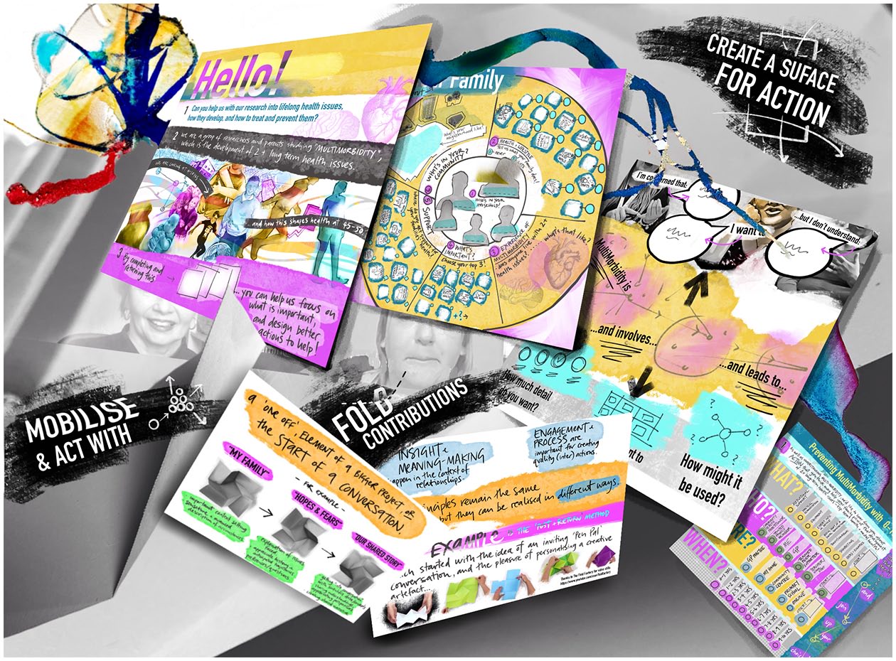 Image by Ian Robson
Taking a knee: haunted memetic counter-activism
Solomon Lennox
In May 2020, the world witnessed Derek Chauvin, a serving White police officer, murder George Floyd, a Black American male. A video of the murder, shot by Darnella Frazier, documented Chauvin kneeling on Floyd’s neck for a little under eight minutes. The video served as a call to action with protests erupting throughout the summer of 2020 across the USA. Activists took to the streets demanding an end to police brutality and systemic racism. The act of kneeling became a recurrent symbol of these protests. This
article specifically focuses on instances where police officers have taken the knee opposite protesters. The author argues that, within this context, kneeling is a memetic performance; it is a unit of cultural information passed on through repetition and mutation. Through mutation (repetition with difference), the symbolic meaning of the act changes. In the case of police officers kneeling opposite protesters, the act purportedly symbolizes moments of solidarity and understanding between the two sides. Much like the video that inspired the protests, instances of officers kneeling opposite protesters were captured, disseminated via social media and went viral. The stillness of these moments promised hope for movement towards a more equitable and humane future. But these images serve as a form of dirty data as they document a future yet to materialize. To this end, the act of kneeling is a haunted
gesture, serving as a form of counter-activism. The act of kneeling by police officers, irrespective of the intentions of the individuals involved, does not solicit an encounter with the ghosts of police brutality and systemic racism. Rather the act, as a mutated form of activism, simultaneously disrupts the atmosphere of protests and reclaims narratives about police conduct, without enacting meaningful change.
‘Imagine talking about politics in a kids’ game’: making sense of #BLM in Nintendo’s Splatoon 2
David Mee and David Jackson
On Twitter and other established digital social networks, references to the Black Lives Matter movement almost doubled after George Floyd’s murder (see Giorgi et al., 2020, ‘Twitter corpus of the #blacklivesmatter movement and counter protests: 2013 to 2020’), alongside a similar rise in references to the counter-protest terms ‘All Lives Matter’ and ‘Blue Lives Matter’. Around the same time, the authors found online players of Splatoon 2 (Nintendo) expressing Black Lives Matter sentiments when using in-game design tools. These messages quickly disappeared in the game space to be replaced by longer-lived political content relating to LGBTQ+ activist sentiments and other non-political messaging. This visual essay provides documentation of memes captured by one of the authors between 6 and 14 March 2020 and discussion of their significance as data. The authors conclude that, despite being digital artefacts, Splatoon posts may be better understood using Cramer’s ‘What Is “Post-digital”’ (2014) reading with different characteristics from normal digital activism artefacts. The visual form attempts to underline the visual character of these post-digital artefacts, which contain no machine-readable textual content or metadata. Nevertheless, they represent a form of community discourse that is little examined and that the authors suggest should be documented and researched despite its awkward data structure.